Case Study · Product Design
HouseConnect
Property managers were drowning in scattered tools. We built a centralized platform that consolidates every landlord workflow — payments, tenants, maintenance, leases — into one unified product.
Role
UX/UI & Product Designer
Timeline
3 Months
Platform
Web (Desktop)
Tools
Figma · Milanote · FigJam
02 — My Role
What I was responsible for
Led end-to-end product design from initial research through final handoff.
Conducted user interviews and synthesized findings into product insights.
Defined the information architecture and navigation strategy.
Built the design system — components, spacing, typography, and state patterns.
Created sketches, wireframes, and high-fidelity screens in Figma.
Collaborated with the engineering team during handoff to ensure implementation accuracy.
03 — UX Challenge
The problem worth solving
Property management is operationally complex. Landlords track payments, coordinate maintenance, manage tenants, and monitor lease cycles — simultaneously, every day.
The tools they were using were either fragmented (separate apps for each workflow) or overwhelming (enterprise platforms with hundreds of features and no clear daily workflow).
The business opportunity was clear: build a product that felt designed for how landlords actually work — not how software teams assumed they worked.
04 — Key Findings
What the research revealed
Landlords managed 4–6 different tools or screens to complete a single workflow.
CriticalOverdue payments were discovered late because they were buried inside transaction logs.
CriticalLease expiry dates were tracked in spreadsheets outside the product.
HighMaintenance status had no priority system — urgent and minor requests appeared identically.
HighEvery competitor offered the same feature set but none unified the daily workflow into one view.
Opportunity05 — Design Goal
One clear objective
Design a property management platform where a landlord can understand the complete health of their portfolio, act on urgent items, and complete daily workflows — all without leaving a single, unified interface.
06 — Research & Discovery
How we understood the problem
User Interviews
Why: We needed to understand how landlords actually spend their time, not how they describe their process in a survey.
Spoke with 5 landlords managing between 3 and 20 properties. Sessions were 45 minutes, task-observation style.
Workflow Analysis
Why: Watching users complete tasks reveals friction that self-reporting misses entirely.
Observed 3 landlords running their morning property check. Counted screen switches, tool changes, and decision points.
Competitor Analysis
Why: Buildium, AppFolio, and Rentec Direct all had similar feature sets. We needed to understand where the category was failing, not just what features existed.
All three competitors offered modules but none presented a unified operational view. The gap was daily workflow, not features.
Information Architecture Audit
Why: Before designing new flows, we needed to understand what content existed and how it was currently organized.
Mapped 8 core workflows and identified 14 navigation decisions required to complete a single morning routine.
07 — Observations
What we saw users actually doing
Users constantly switched between properties, tenants, and payment screens for a single task.
Properties had no contextual data — opening a property showed a list, not a status.
Maintenance requests were not prioritized — all requests looked equally urgent.
Overdue rent was only visible inside a transaction table, never surfaced proactively.
Lease renewals were tracked in external spreadsheets because the product gave no early warning.
Navigation interrupted every workflow — each screen was an isolated destination.
08 — Key Insights
Observations turned into product thinking
Observation
Users switched between modules constantly.
Insight
Landlords think in properties, not application modules.
The product was organized around data types, but landlords mentally organize around their properties.
Observation
Overdue payments were missed until they became problems.
Insight
Critical information needs to find the user, not the other way around.
Users shouldn't have to hunt for what's urgent. The dashboard needs to surface exceptions proactively.
Observation
Lease renewals tracked in spreadsheets.
Insight
Users workaround the product when it doesn't warn them in time.
If the product doesn't show upcoming expiry, users build external systems — a clear design failure.
Observation
Maintenance requests all looked the same.
Insight
Without priority, everything becomes noise.
A burst pipe and a broken light switch should never appear with equal visual weight.
09 — Design Principles
The rules that guided every decision
Property First
Every screen is organized around the property, not the application module.
Surface Exceptions
The product finds urgent items for the user. Nothing critical should be buried.
Connected Workflows
Tasks that belong together stay together. No unnecessary navigation.
Prioritize Daily Operations
The most common daily tasks should require the fewest interactions.
Scalable Architecture
The information structure should work for 2 properties or 200.
10 — How Might We
The design question
"How might we design a property management experience where landlords can understand their portfolio's health, act on urgent items, and complete daily workflows — without ever switching tools or losing context?"
11 — Solution Strategy
The product thinking behind the design
Information Architecture
Organized the product around two layers — daily operations (dashboard, payments, maintenance) and management records (tenants, properties, leases). Daily operations are one click from anywhere.
Navigation Strategy
A persistent left sidebar with 6 primary destinations. Every screen is reachable in two clicks maximum. No nested navigation, no modal-heavy flows.
Dashboard Strategy
The dashboard is not a summary page. It's a command center. Priority alerts at top, contextual metrics below. The system tells you what's urgent — you decide what to do.
Workflow Simplification
Common tasks — viewing a tenant's payment status, marking maintenance as resolved, checking lease expiry — require 0–1 additional clicks from the screen where they're discovered.
Design System
Built a consistent component library: table rows, status badges, metric cards, and empty states. Consistency reduces cognitive load — users learn patterns once, apply them everywhere.
12 — Design Evolution
From first sketch to final screen
Each step in the progression was a decision, not just an aesthetic improvement. Here's how three key screens evolved.
Dashboard Screen
The primary control center for property managers — surfacing urgent tasks, occupancy analytics, and payment status.
Hand Sketch
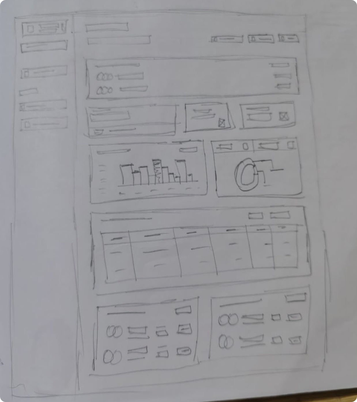
Early sketch mapping structural layout, navigation position, and content zones.
Figma Wireframe
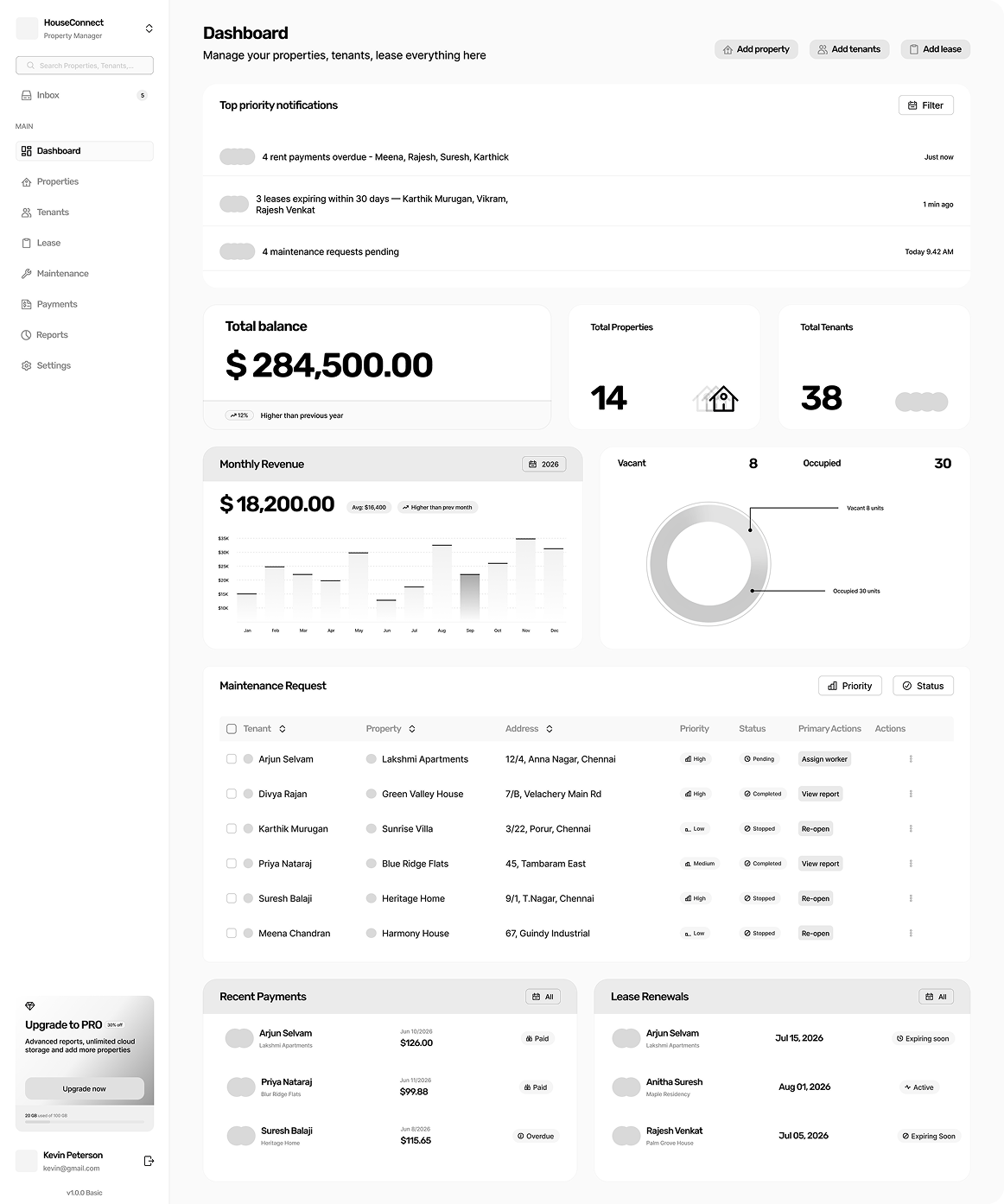
Grayscale wireframe defining layout grids, sizing balance, and spatial relationships.
Final Design
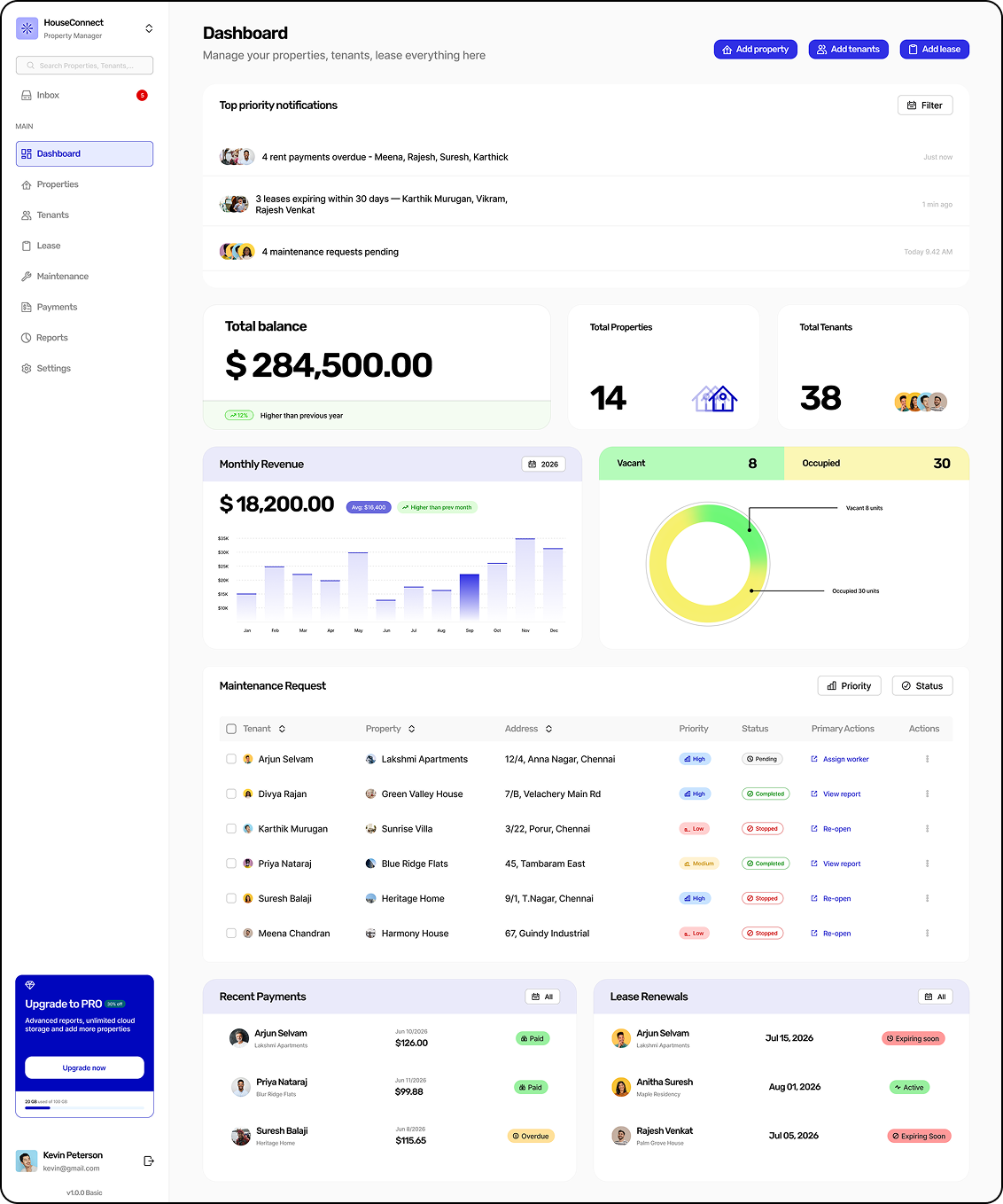
Production UI with priority alerts, occupancy metrics, and payment summaries.
Tenant Screen
The tenant directory — mapping occupant details, lease schedules, and payment status in one scannable table.
Hand Sketch
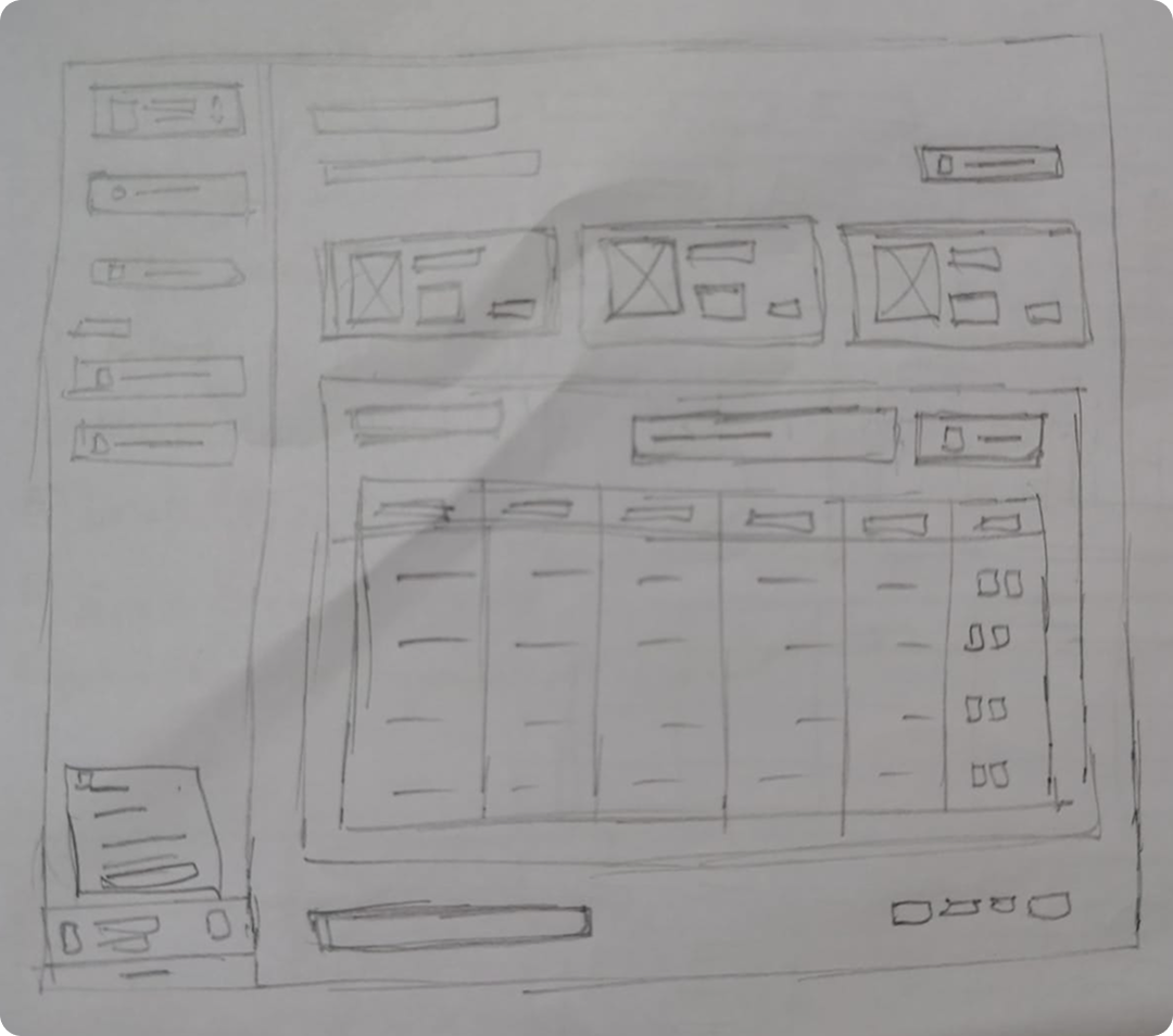
Conceptual sketch showing tenant rows, quick filters, and status indicators.
Figma Wireframe
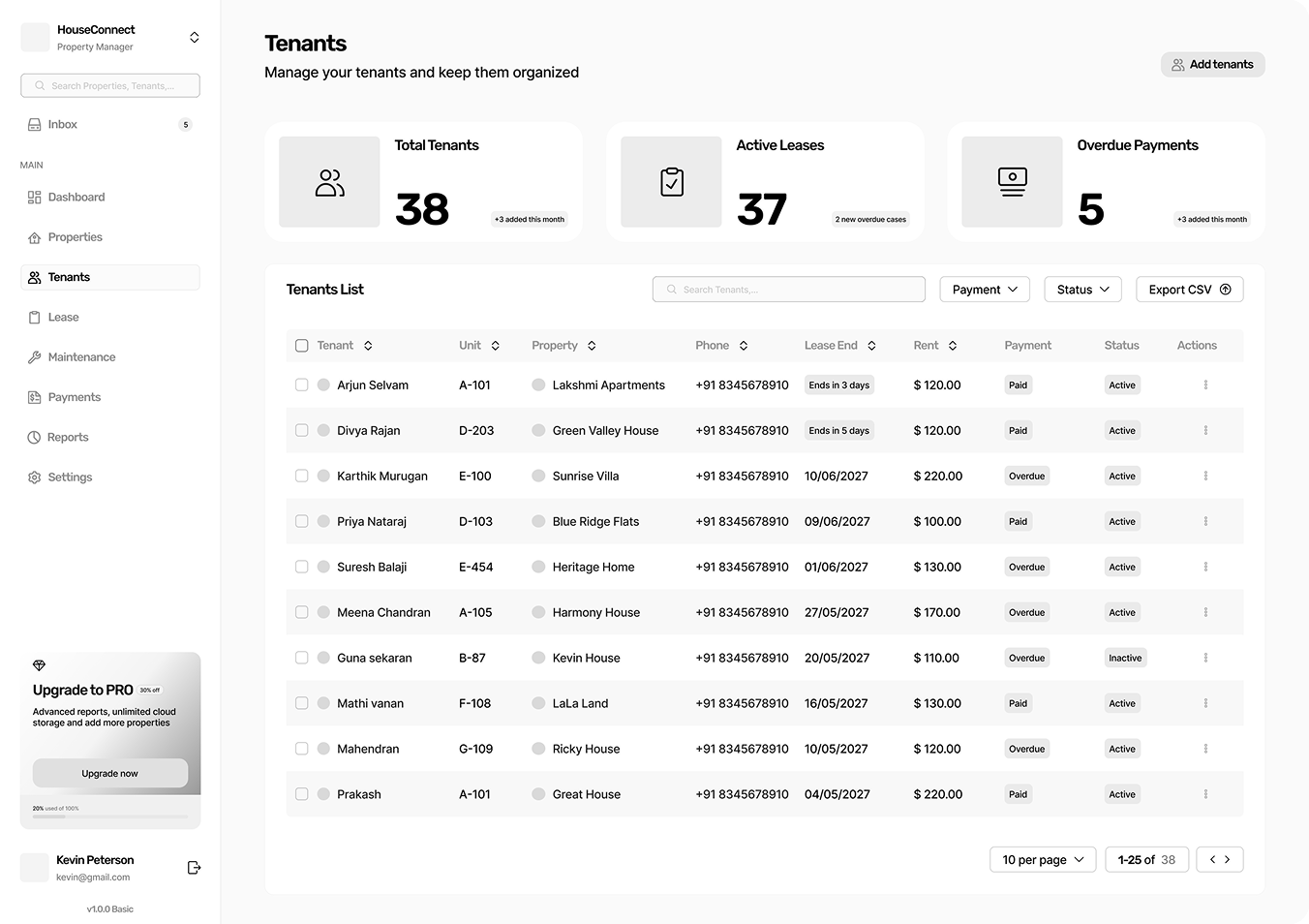
Figma layout determining column hierarchy, alignment, and spacing margins.
Final Design
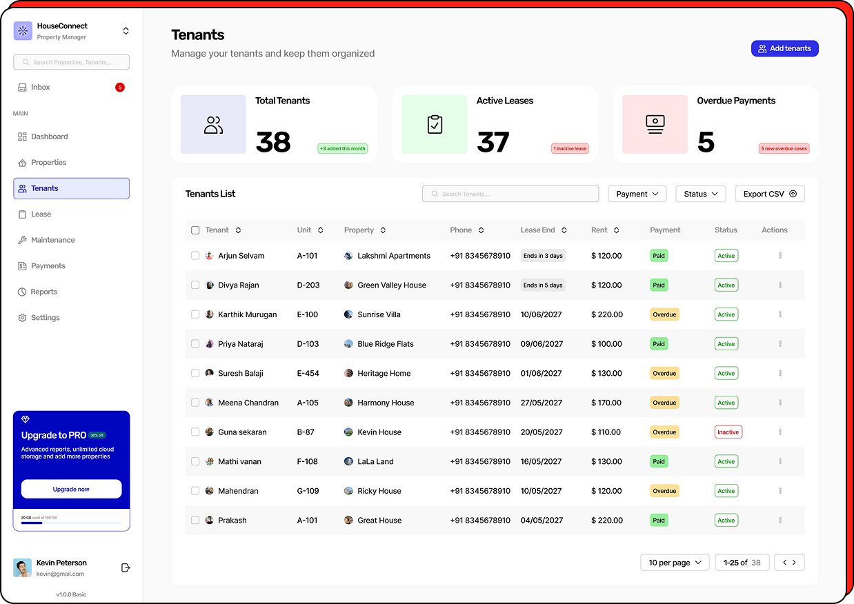
Final UI displaying the tenant table with inline status badges and lease indicators.
Payments Screen
The ledger — tracking rental revenue, overdue payment flags, and transaction history in a status-first layout.
Hand Sketch
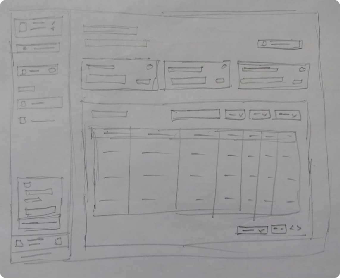
Rough sketch of billing cards, transaction tables, and payment status flows.
Figma Wireframe
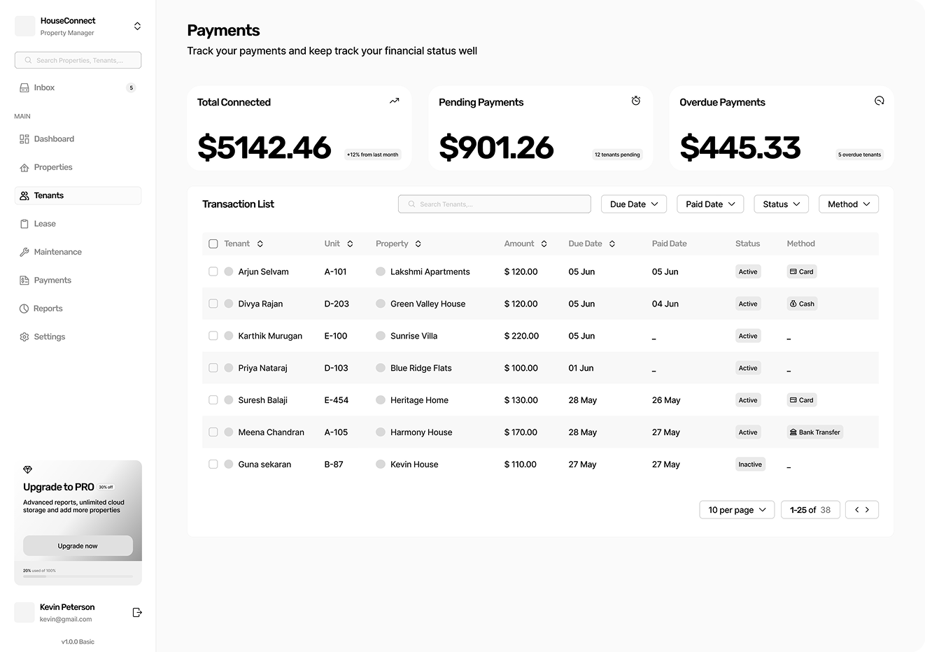
Digital wireframe standardizing ledger fields, spacing rules, and action items.
Final Design
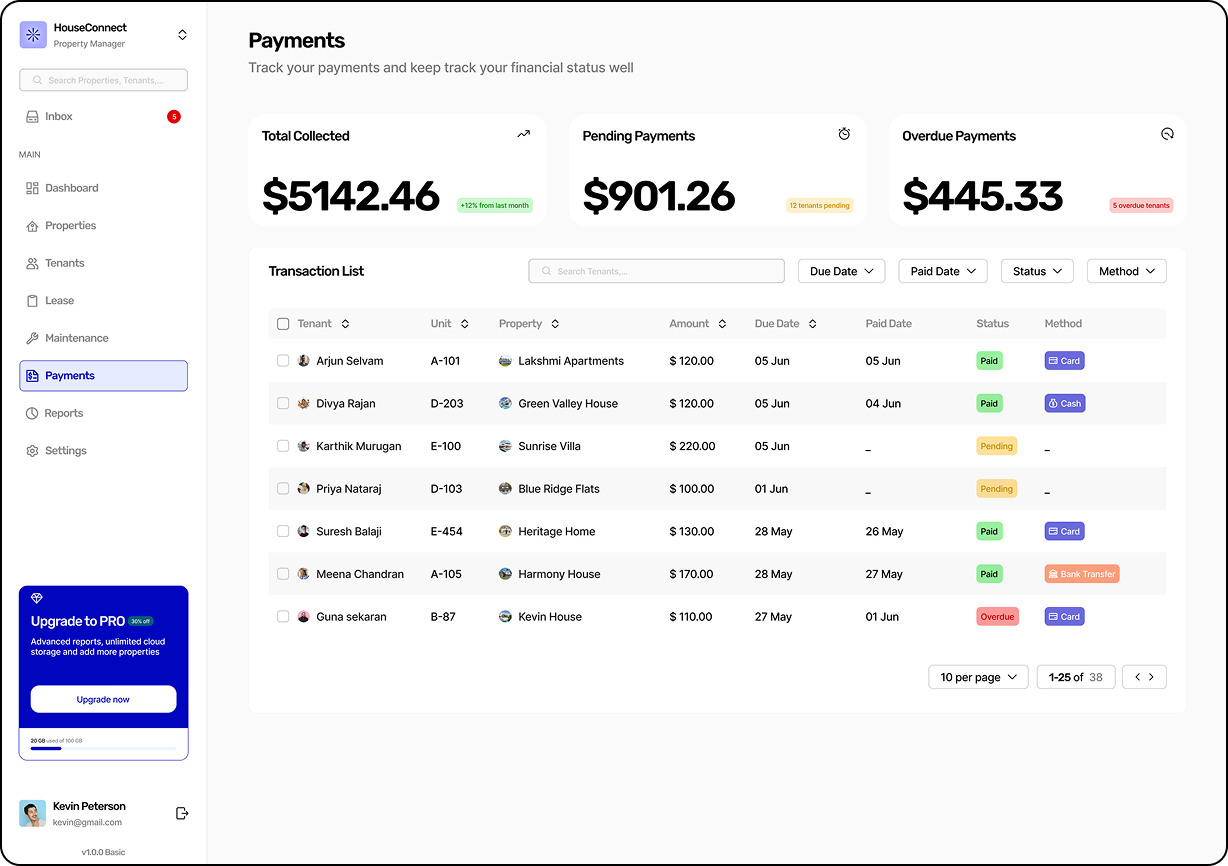
Polished payment screen with status grouping and overdue visibility.
13 — Final Solution
How each feature solved a real problem
Problem
Users had no single place to understand the health of their portfolio. They opened 4–6 screens before starting any task.
Design Decision
Built a priority-first command center. The top of the dashboard surfaces urgent items — overdue payments, expiring leases, open maintenance. Below that, occupancy overview and revenue analytics.
Rationale
The dashboard should answer one question every morning: 'What needs my attention today?' Everything else is secondary.
Dashboard — priority alerts at top, occupancy and revenue below.
Problem
Tenant details were scattered. Payment status, lease dates, and contact info lived on separate screens with no connection.
Design Decision
Designed a searchable table with inline status badges — payment status, lease expiry, and unit number visible without opening a record. One click opens the full tenant profile.
Rationale
Property managers handle tens to hundreds of tenants. They need fast scanning and filtering, not card-based browsing.
Tenant table — scan, filter, and act without navigating away.
Problem
Overdue payments were hidden inside a generic transaction list, requiring landlords to manually check dates.
Design Decision
Surfaced overdue balances with explicit alert tags and quick action buttons to issue reminders directly from the ledger.
Rationale
Prompt rent collection is critical for property managers. Financial friction must be highlighted immediately.
Payment ledger — clear overdue flags and status tracking.
14 — Design Decisions
From research finding to design choice
Research Finding
Users managed 4–6 screens per workflow.
Problem
Navigation overhead reduced daily efficiency.
Design Decision
Created a unified dashboard that surfaces the top 80% of daily tasks in one view.
Expected Outcome
Users can complete most morning checks without switching screens.
Research Finding
Overdue payments discovered late.
Problem
Missed revenue due to low visibility.
Design Decision
Overdue payments surfaced as priority alerts at the top of the dashboard.
Expected Outcome
Critical financial exceptions are never missed in a regular workflow.
Research Finding
Lease renewals tracked externally.
Problem
Vacancies created due to late action on expiring leases.
Design Decision
Lease expiry badges ('Ends in 3 Days') shown directly in the tenant table.
Expected Outcome
Proactive lease management without needing external tools.
Research Finding
All maintenance requests appeared equal.
Problem
Urgent requests mixed with low-priority ones caused delays.
Design Decision
Priority tagging (Critical, High, Normal) with visual hierarchy in the request list.
Expected Outcome
Urgent maintenance is visible and actionable immediately.
15 — Impact
What changed for the user
Reduced Navigation Complexity
The unified dashboard eliminates the 4–6 screen switches required to complete a morning portfolio check. Most urgent tasks are visible without navigation.
Better Workflow Continuity
Contextual actions are co-located with the information that triggers them. Discovering an overdue payment and sending a reminder happens in the same view.
Improved Information Visibility
Critical exceptions — overdue payments, expiring leases, urgent maintenance — are proactively surfaced rather than buried inside data tables.
Scalable Enterprise Architecture
The design system and information architecture scales from a landlord with 3 properties to an enterprise managing 200+. The structure doesn't change, the density does.
Simplified Daily Operations
Routine tasks now require fewer interactions. What previously took 20 minutes of multi-tool management is completed in a single focused session.
Eliminated External Workarounds
Lease expiry warnings and payment status visibility removed the need for the external spreadsheets landlords were using to compensate for the product's blind spots.
16 — Reflection
What I would do differently
What I learned
The most important design skill in enterprise product work is knowing what NOT to show. The dashboard only works because we made hard decisions about what stayed off it. Curation is a design skill.
What I would improve
I'd invest more time in the empty states and onboarding flow. A landlord setting up their first property sees the product at its worst — a blank dashboard with no data. That first session is a critical product moment we didn't fully design for.
Future usability validation
I'd run structured task-completion sessions with 5 property managers using the prototype. Specifically measuring: time to identify the most urgent item on the dashboard, and steps required to resolve an overdue payment.
Product opportunity
The next product layer is proactive communication — automated tenant reminders for rent, maintenance status updates, and lease renewal prompts. The data is already in the platform; the product just needs to act on it.