Case Study · Mobile App UX
Making Local Bus Travel More Predictable
A real-time bus tracking experience that helps students and daily workers know when their bus will arrive, reducing waiting time and uncertainty.
Role
Lead UX Designer
Timeline
May 2025 — Present
Platform
Mobile (iOS & Android)
Focus
Bilingual Transit UX
02 — My Role
Lead UX Designer Responsibilities
Research Planning & Strategy
User Interviews & Field Observations
UX & Visual Design
Design System Development
Interactive Prototyping
Usability Testing & Iteration
03 — UX Challenge
Solving commuter uncertainty
How Might We Statement
"How might we help daily commuters travel on local buses without uncertainty?"
In Tamil Nadu, people rely on both government and private buses for their daily commute. However, bus routes and timings can change, making it difficult for commuters to know which bus to take and when it will arrive.
As a result, students, daily workers, and occasional commuters often spend unnecessary time waiting, miss buses, or reach their destinations late.
04 — Information Gathering
User Research with 35 Participants
To understand the challenges faced by local bus commuters, I conducted user research through Google Forms and face-to-face interviews with 35 participants.
Participant Metrics
Daily Workers
Depend on daily buses for job commutes
College Students
Travel daily to institutions on strict schedules
Regular Commuters
Travel for leisure, errands, or irregular visits
Older People
Require accessible, non-complex interface options
Research Focus Areas
How people currently find bus routes and timings
What information they need before starting a journey
How they deal with delays and unexpected changes
What difficulties they experience when traveling to unfamiliar destinations
How different types of commuters access bus information
05 — Observations
Key Field Observations
Route & Timing Confusion
Most participants mentioned that finding the correct bus route and departure time is difficult, particularly when traveling to an unfamiliar destination.
Occasional Commuters Face More Uncertainty
Occasional commuters often have difficulty identifying which bus to take and when it will arrive, which can lead to unnecessary waiting and delays.
Unpredictable Bus Changes
Students and daily commuters mentioned that delays, breakdowns, and changes in bus timings make it difficult to plan their journeys reliably.
Accessibility Needs
Some older participants expressed difficulty accessing digital services, suggesting that bus information should be simple and easy to understand.
06 — User Voice
Participant Quotes
"Sometimes I know the bus number, but I don’t know when it will come. So I just wait at the bus stop."
— Daily Commuter"If I have to go somewhere I haven’t been before, I usually ask someone which bus I should take. I’m not sure by looking at the route."
— Occasional Commuter"When the bus is late or not coming, we don’t know until we reach the bus stop. Sometimes I have to wait for another bus."
— Student"I usually ask someone at the bus stop which bus goes there. Sometimes I’m not sure whether I’m waiting at the right place."
— Older Commuter07 — Research Synthesis
Research Insights
Finding a bus is not always straightforward
Passengers may know their destination but are not always sure which bus or route they should take.
Reliability is as important as availability
Knowing the bus route alone is not enough. Commuters also need confidence that the bus will arrive when expected.
Unplanned changes increase travel uncertainty
Delays, breakdowns, and schedule changes can disrupt journeys, especially for people who depend on buses for work or education.
Bus information should be accessible to different users
Not every passenger will be equally comfortable navigating a smartphone application, creating an opportunity for alternative ways to access information.
08 — Refined HMW
How Might We?
"How might we help daily commuters find the right local bus and know when it will arrive?"
09 — Solution Exploration
Core Features Explored
Live Bus Tracking
Show the current location of a bus so commuters can understand where it is during their journey.
Accurate Arrival Time
Provide an estimated arrival time so users can decide when to leave for the bus stop.
Visual Routes
Use a visual route map to help commuters understand the bus journey and identify the correct route.
Fare Information
Show the expected fare before boarding to reduce uncertainty around travel costs.
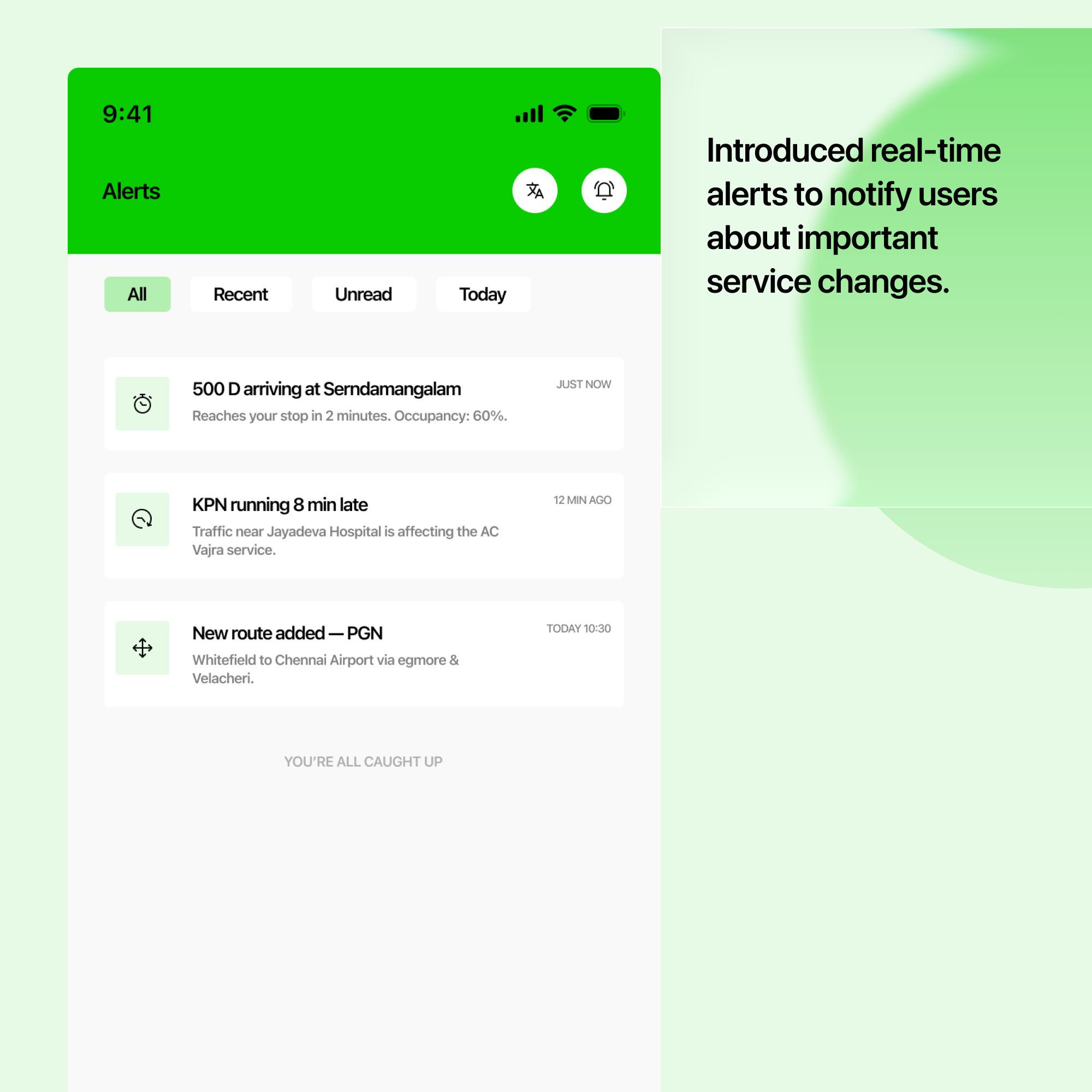
Real-Time Alerts
Notify users about delays, breakdowns, and significant changes to bus services.
Save Frequent Routes
Allow regular commuters to save commonly used routes for faster access.
Nearby Bus Stops
Help users discover nearby bus stops based on their current location.
Departure Reminder
Remind users when they need to leave to catch their selected bus.
10 — Feature Prioritization
Impact vs. Effort Matrix
Features mapped on a 2x2 UX prioritization matrix balancing commuter impact against technical execution effort.
ETA (Estimated Arrival Time)
Core MVPBus Routes & Stop Sequence
Core MVPNearby Bus Stops
Frequent Routes
Departure Reminder
Delay Alerts
AlertsLive GPS Bus Tracking
High TechMulti-Lingual Support (Tamil & English)
BilingualFastest Route Finder Algorithm
Real-Time Service Updates
Dark Theme & Visual Preferences
UI ThemeCustom Sound Notifications
Skip11 — Wireframing & Testing
Low-Fidelity Exploration & Testing
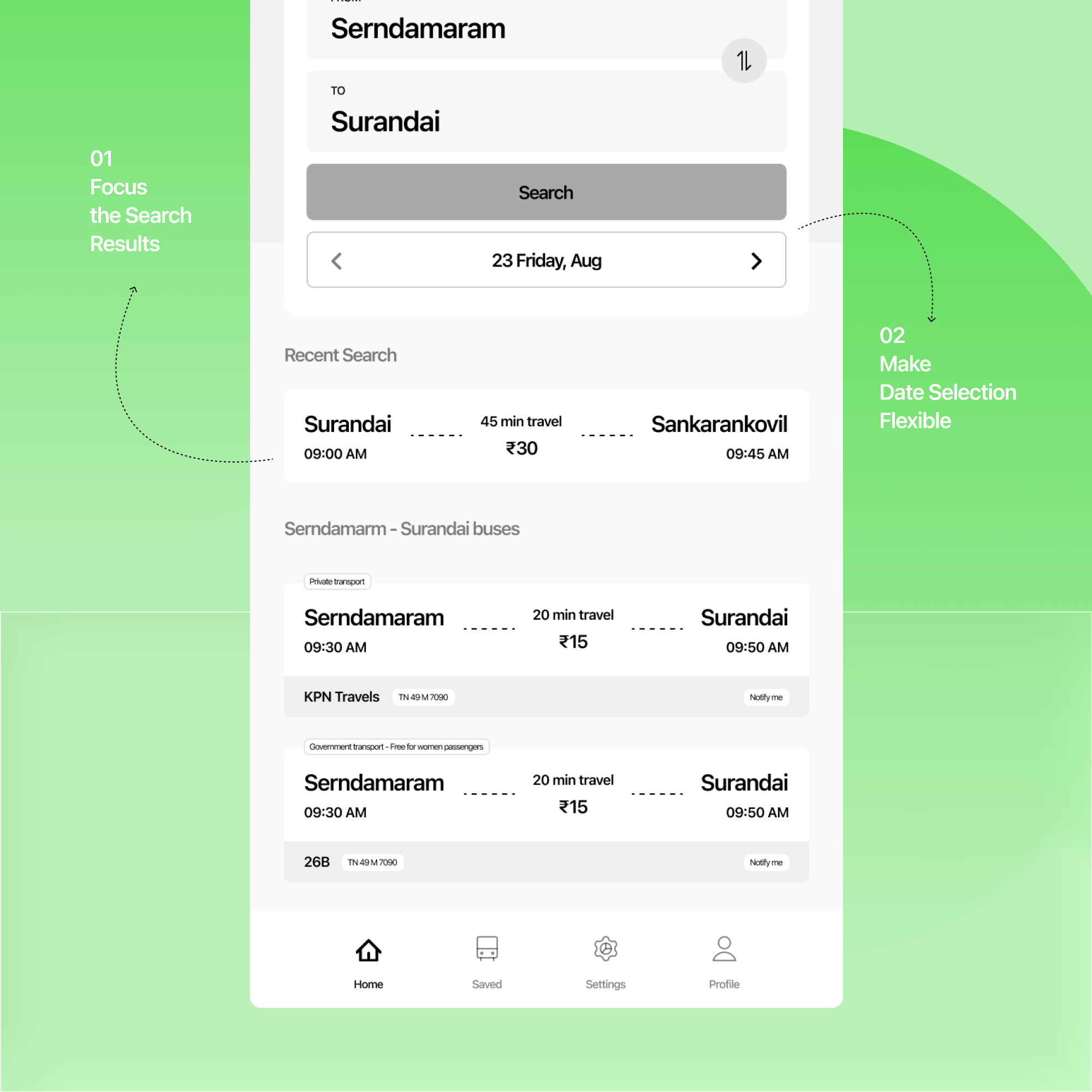
I created low-fidelity wireframes to explore the bus search experience and identify areas where the flow could be clearer.
Focus the Search Results
The initial home screen showed general bus information. I changed it to show only buses relevant to the user's selected route, making the results easier to scan.
Make Date Selection Flexible
The initial design used a fixed date. I introduced a dynamic date selector so users can select different days and navigate between months when planning their journey.
Clarify the Save Action
The bus card contained route, bus, timing, and fare information. Placing the Save action there could make it unclear what the user was saving.
I moved the Save action to the route details screen, where users can review the complete route before saving it.
12 — Usability Testing
Testing Insights & Design Iterations
I conducted quick usability testing with 5 participants to understand whether users could easily find a bus, understand its arrival time, and follow the route in the initial design.
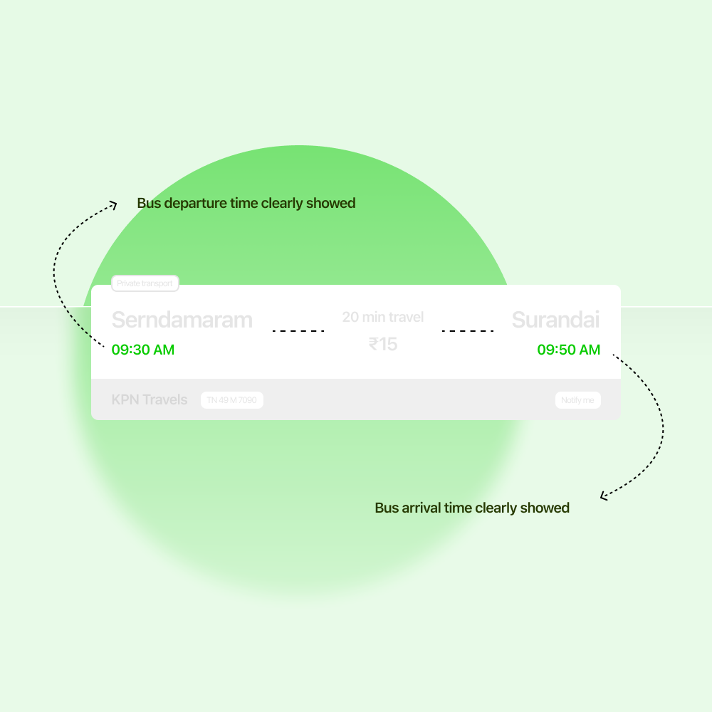
Users wanted to know the bus arrival time immediately
Some participants first looked for the bus arrival time instead of exploring the other information on the screen. The ETA was not prominent enough in the initial design.
Made the estimated arrival time more prominent and placed it near the bus and route information so users could understand it at a glance.
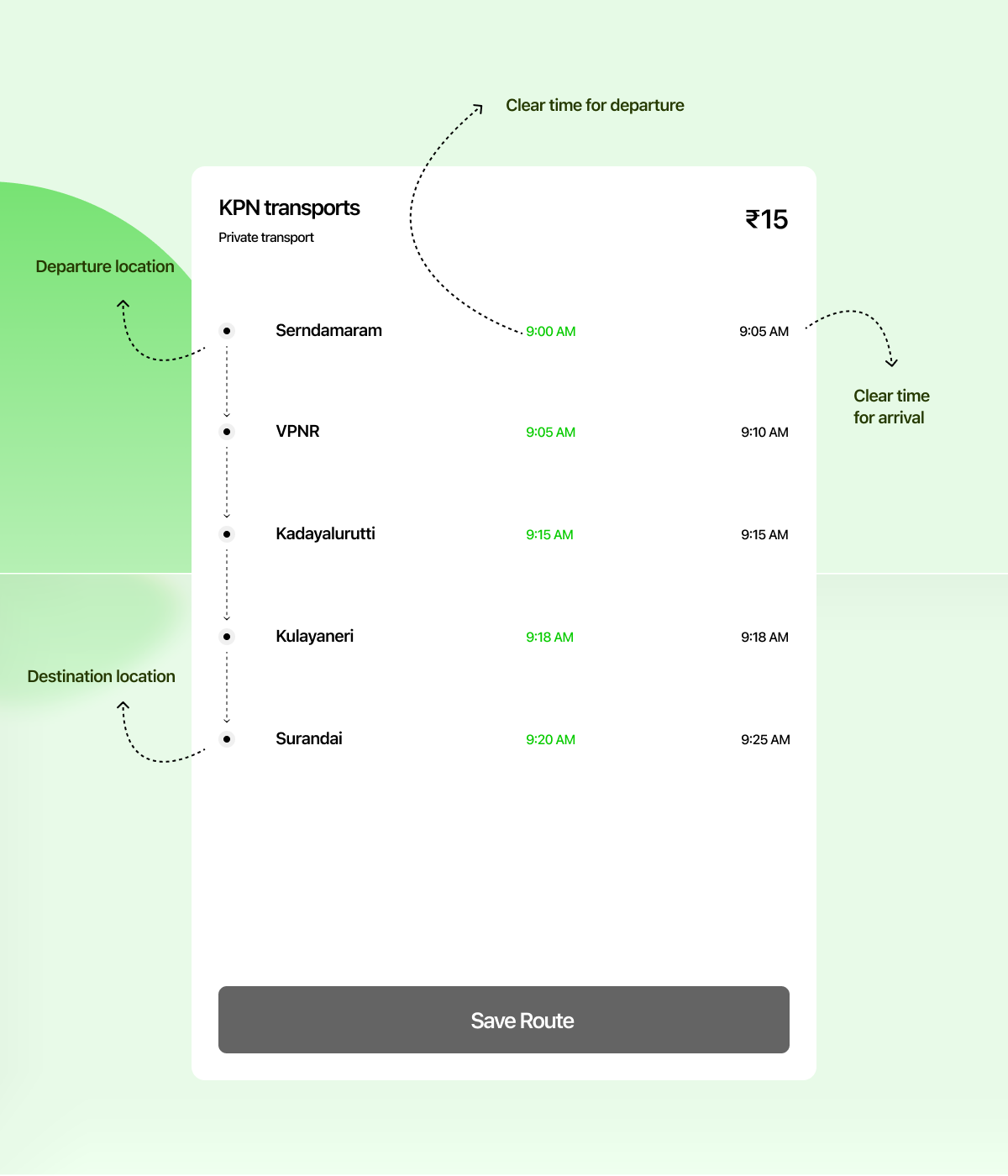
Users found the route information difficult to follow
Participants could identify the bus number, but some were unsure about the stops between their current location and destination when the route was shown mainly as text.
Introduced a visual route map with the current location, upcoming stops, and destination to make the journey easier to understand.
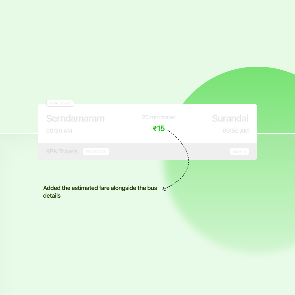
Users wanted to know the fare before choosing a bus
Some participants checked the route and timing first but then asked how much the journey would cost. Fare information was not immediately visible in the initial design.
Added the estimated fare alongside the bus details, allowing users to compare buses based on route, arrival time, and cost.
13 — Final Solution
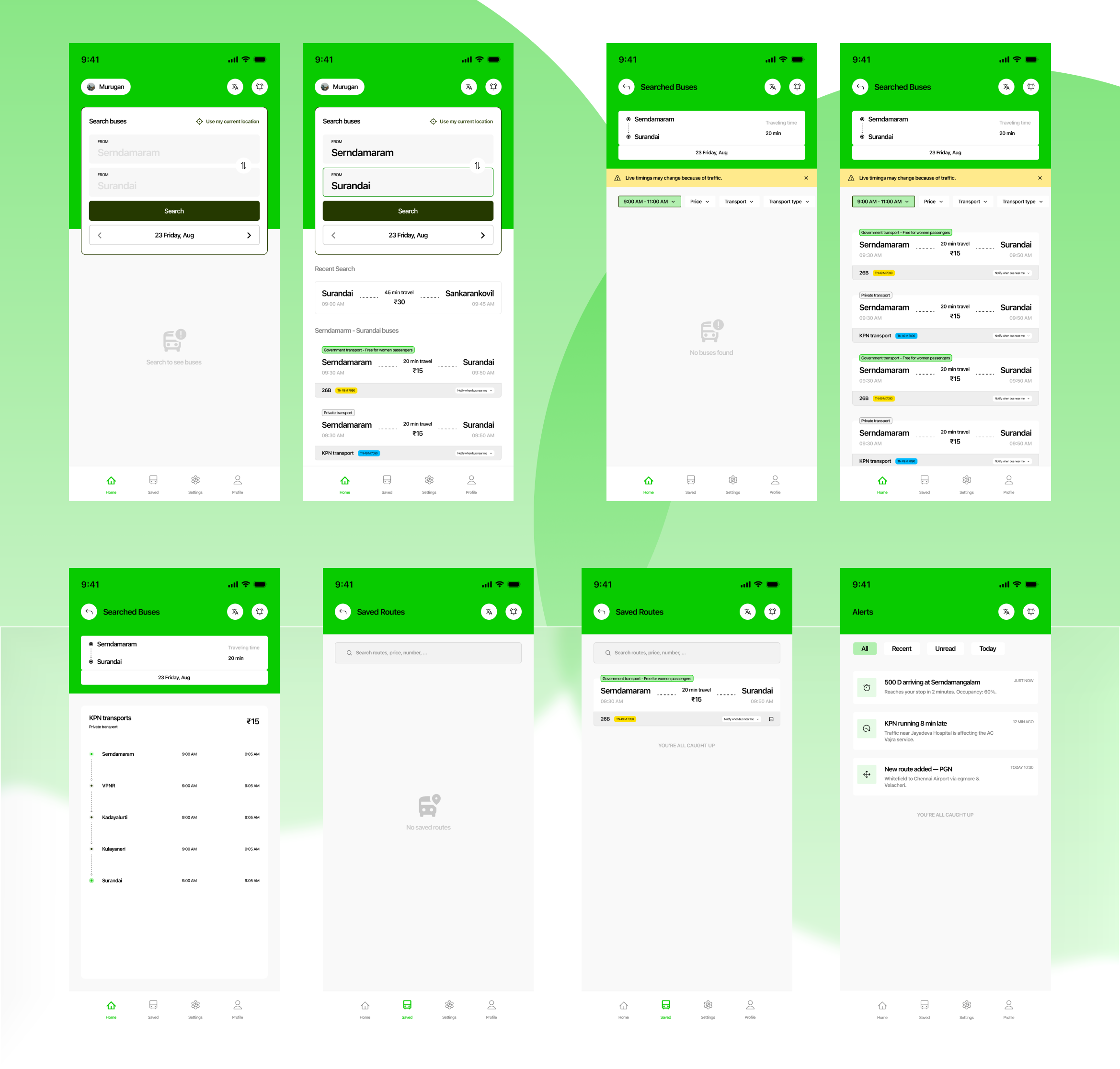
UI Execution & Core Flows
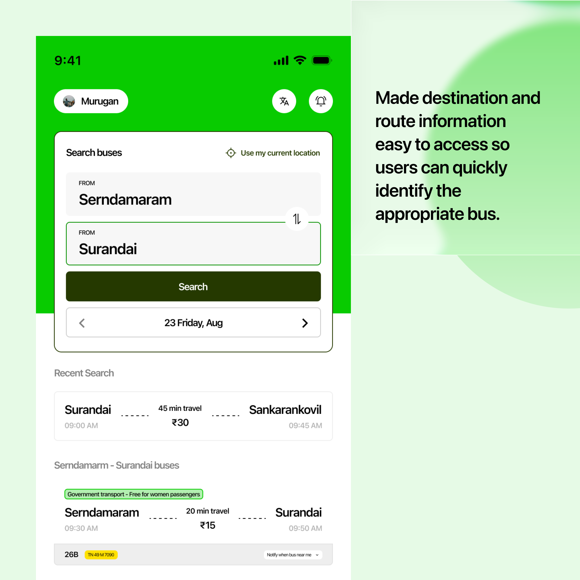
Finding the Right Bus
Occasional commuters often struggle to identify which bus they should take.
Made destination and route information easy to access so users can quickly identify the appropriate bus.
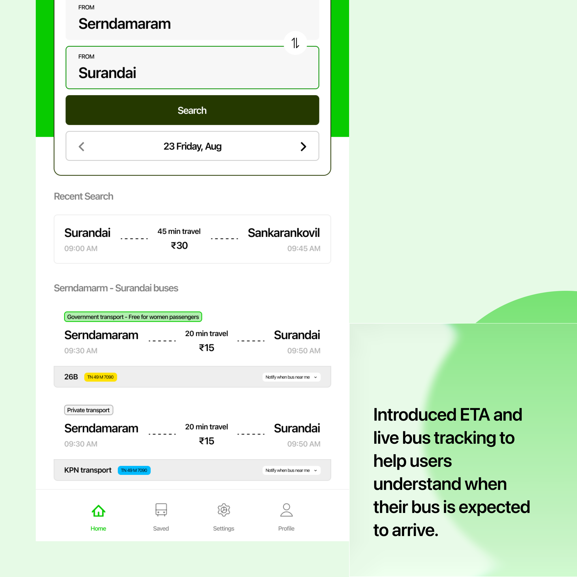
Knowing When the Bus Will Arrive
Unexpected delays and uncertain arrival times can cause unnecessary waiting.
Introduced ETA and live bus tracking to help users understand when their bus is expected to arrive.
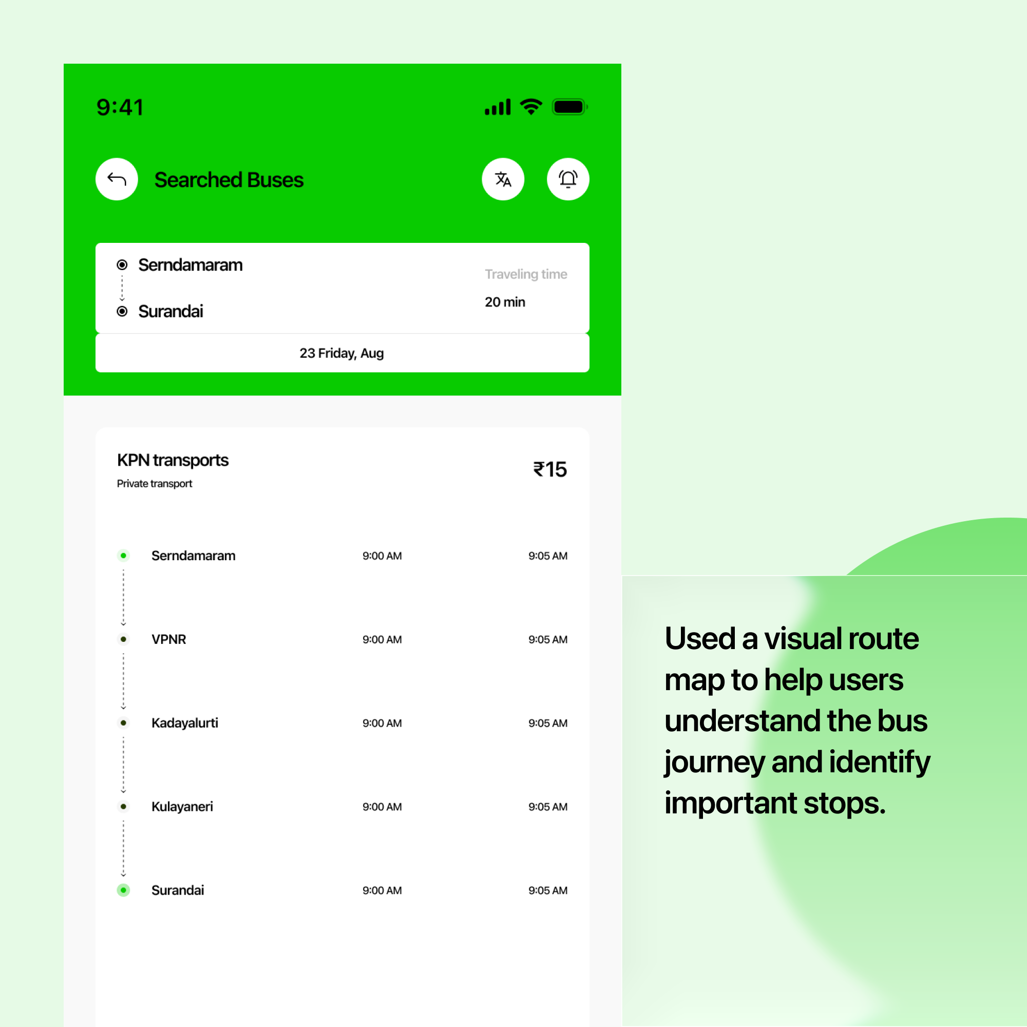
Understanding the Route
Text-based route information can be difficult to understand, especially when traveling to an unfamiliar destination.
Used a visual route map to help users understand the bus journey and identify important stops.
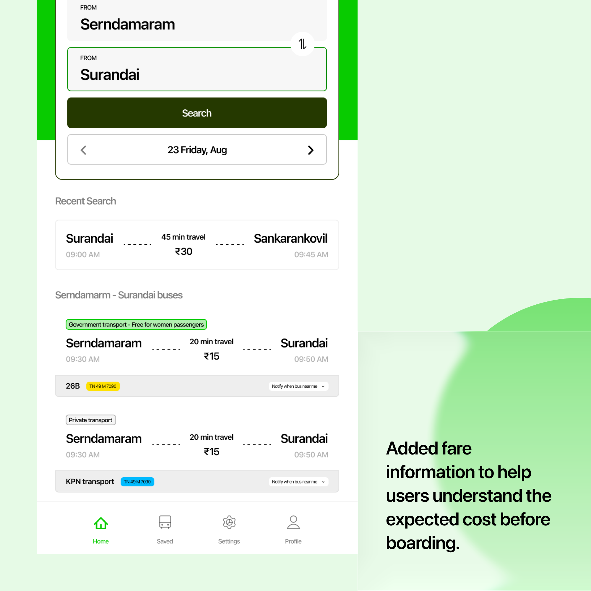
Understanding the Fare
Passengers may not know the expected fare before starting their journey.
Added fare information to help users understand the expected cost before boarding.
Staying Updated
Delays, breakdowns, and schedule changes can disrupt planned journeys.
Introduced real-time alerts to notify users about important service changes.
14 — Inclusive Design
Accessibility — Alternative Access Channel
Some passengers may find it difficult to access bus information through a smartphone application. To make the service more inclusive, I explored an alternative access channel where passengers can call or message a dedicated number to request bus routes and timings in their preferred language.
Proposed Service Flow
Passenger: Cholapuram → Madurai
Available buses:
• 8:30 AM — Route 12
• 9:15 AM — Route 18
• 10:00 AM — Route 24
This service could eventually be supported by an automated voice or messaging system to reduce dependency on manual assistance.
15 — Design Tokens & Components
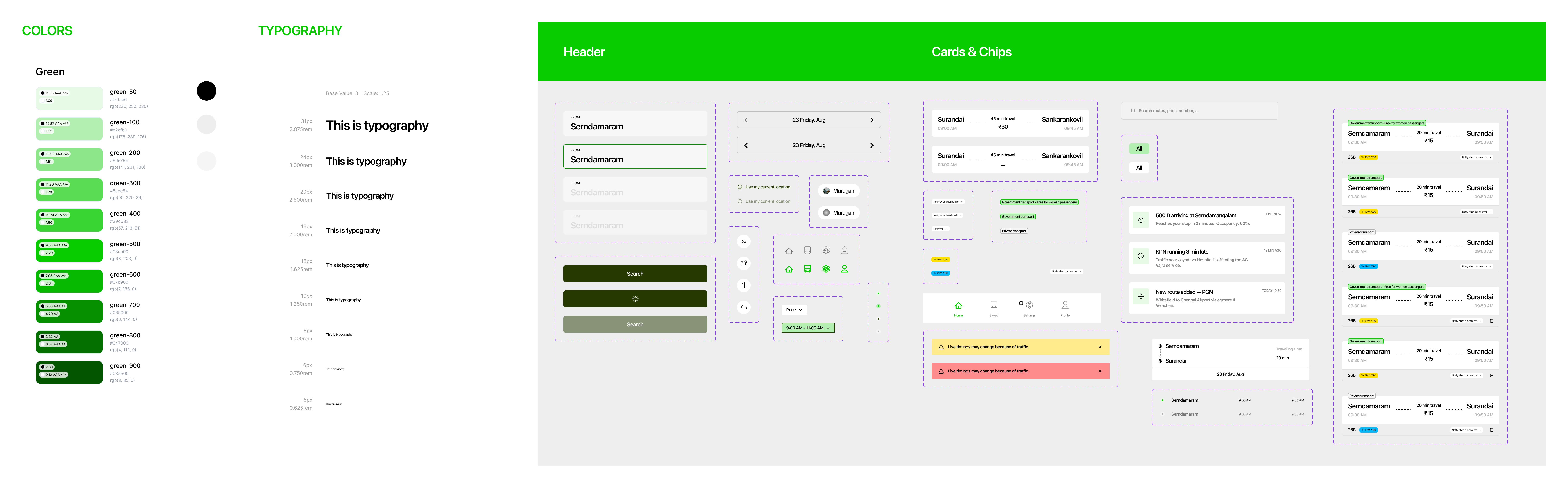
Design System
Typography
System hierarchy, font scales, weights, and Tamil/English bilingual typography rules.
Colors
High-contrast palette, accessible route status colors, and dark mode tokens.
Components
Buttons, cards, navigation bars, bus status badges, and map components.
Design Principles
Clear information hierarchy
Easy route discovery
Accessible information
Minimal interaction
Real-time visibility
16 — Reflection
Learnings & Next Steps
Designing for Uncertainty
I learned that the biggest challenge was not simply helping users find a bus, but helping them feel confident that the information they received was reliable.
Balancing User Needs and Feasibility
Real-time tracking can significantly improve the experience, but it also requires reliable location data and supporting infrastructure. This helped me consider technical feasibility alongside user needs when prioritizing features.
Designing for Different Users
The research also made me consider passengers who may not be comfortable using smartphone applications and encouraged me to explore alternative ways of accessing the same information.
What I Would Explore Next
If I continued developing the product, I would validate the real-time tracking experience with more commuters and explore the feasibility of multilingual voice and messaging support.